#️⃣ Number Input Setting
There are 2 different number inputs, Standard and Slider, depending on the value of slider.
By default, step is 1, which allows only integers. Setting step to 'any' will allow any decimal numbers.
min and max values aren't strictly enforced, so ensure that you validate them in your code.
Standard Number Input
type NumberInputSetting = {
  type: 'number-input'
  label: string
  id: string
  defaultValue?: number | null
  min?: number
  max?: number
  step?: number | 'any'
  placeholder?: string
  description?: string
}
If no
defaultValueis given, the default value isnull, and will also benullif the user empties out the input field.
Slider Number Input
Set slider to true to create a slider number input.
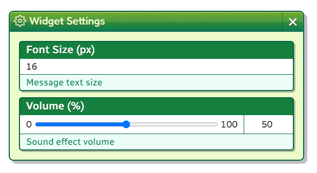
A slider is shown with the min and max values labeled, alongside a standard number input that shares the slider value and can be directly modified.
type NumberSliderInputSetting = {
  type: 'number-input'
  label: string
  id: string
  slider: true
  defaultValue?: number | null
  min?: number
  max?: number
  step?: number | 'any'
  placeholder?: string
  description?: string
}
If no
defaultValueis given, the default value isnull, and will also benullif the user empties out the input field.For sliders, by default,
min === 0andmax === 100.
Example
addEventListener('slime2:ready', () => {
  slime2.widget.loadSettings('widget-data.js', [
    {
      label: 'Font Size (px)',
      id: 'fontSize',
      type: 'number-input',
      defaultValue: 16,
      step: 1,
      min: 8,
      description: 'Message text size',
    },
    {
      label: 'Volume (%)',
      id: 'volume',
      type: 'number-input',
      slider: true,
      defaultValue: 50,
      step: 1,
      min: 0,
      max: 100,
      description: 'Sound effect volume',
    },
  ])
}){ "fontSize": 16, "volume": 50 }